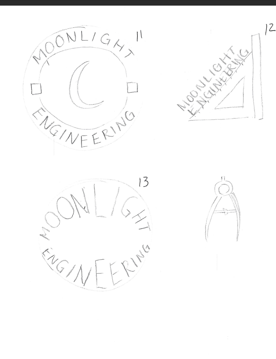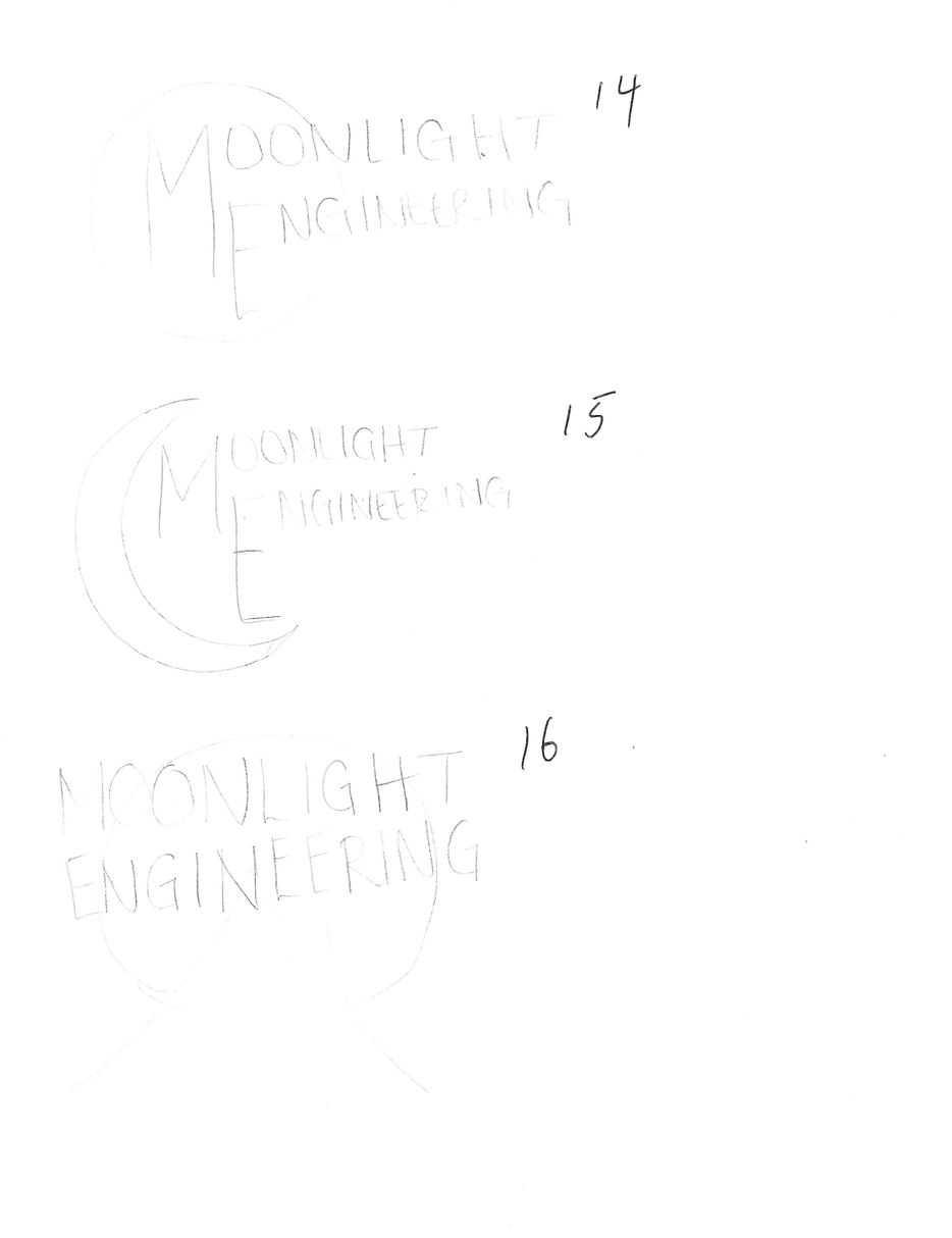
A page from Gabrielle’s sketchbook

A little look at how my brain works.

little note

design starts with a feeling.
then color.
then the tiny details.
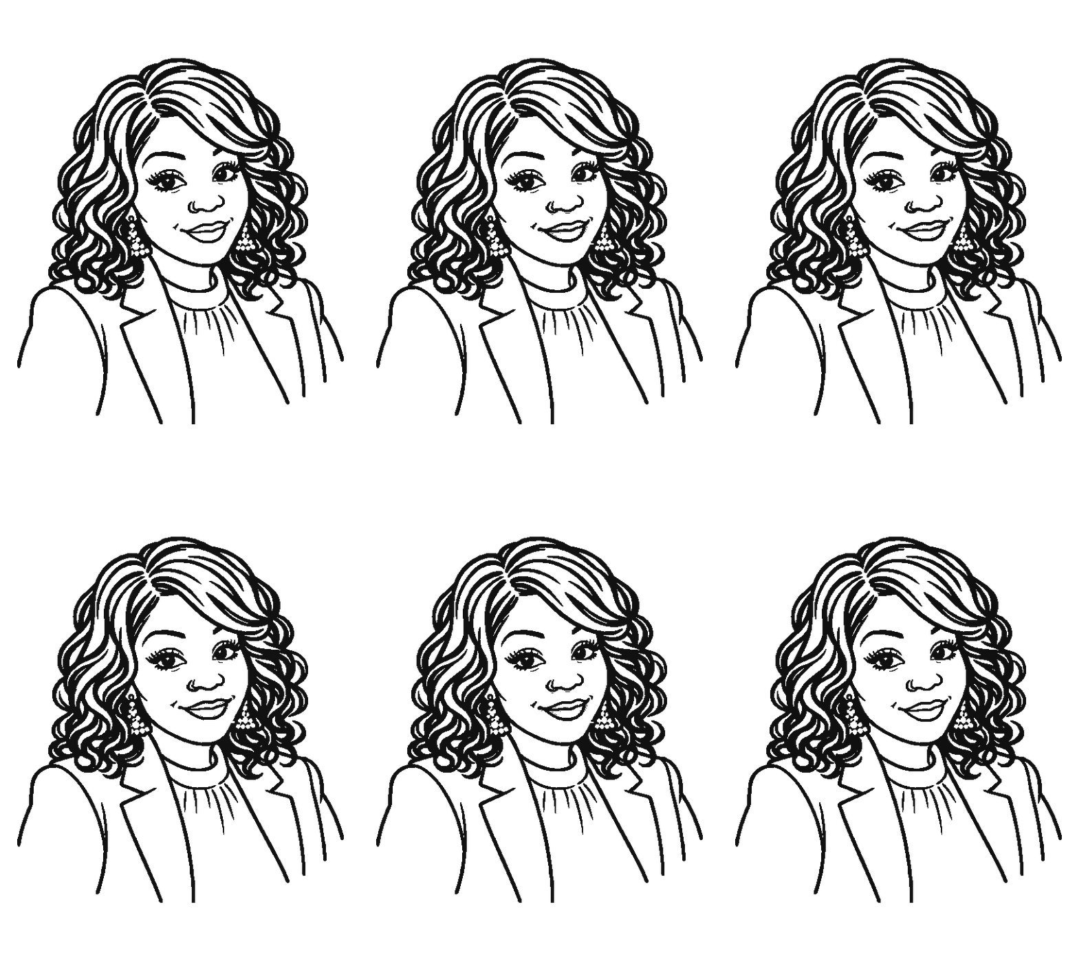
Gabrielle illustrated portrait
hi, i’m Gabrielle.
color matters more
than people think
the tiniest shift
changes the feeling.
probably nudging
something 2px
currently...

somewhere between sage & olive.

collecting details, noticing why they matter.
grace = the details
purpose = the reason behind every choice
✦✧✦
Menu
Creative work with intention

Creating brands with grace.
Growing businesses with purpose.

Graphic design, digital marketing, and social media—created with intention.
top of page
bottom of page
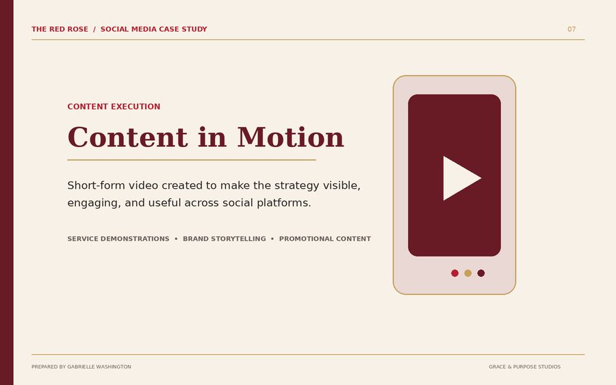
CONTACT SHEET 03 · CONTENT IN MOTION

Content
in motion.

Social media lives differently than a poster on a wall. Here the work behaves like captured moments — strategy, content and platform thinking coming out of the camera frame by frame.
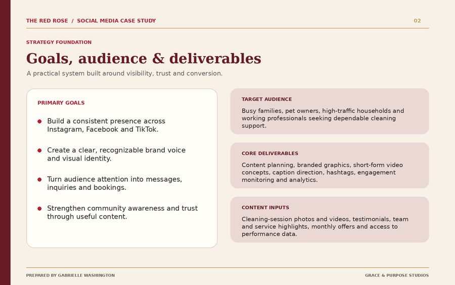
Strategy snapshot
fresh from the idea ↗
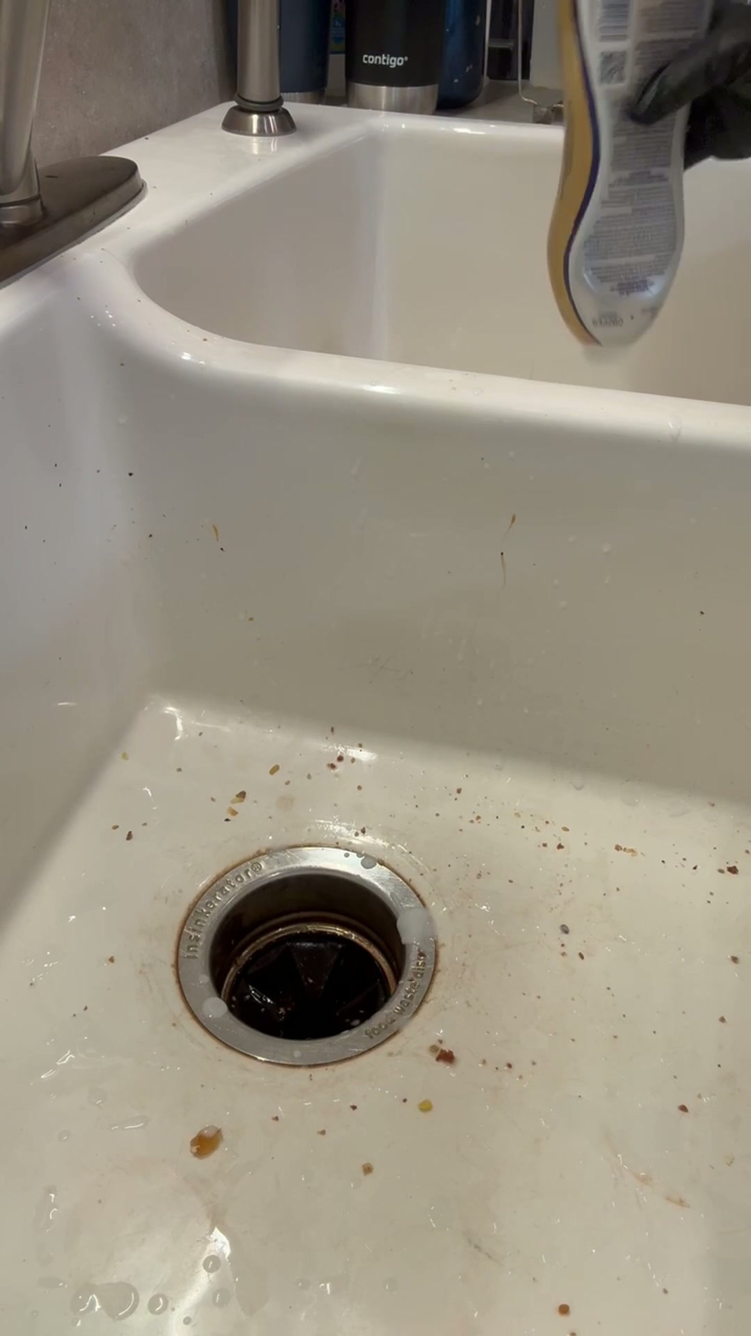
Snap & it’s Spotless
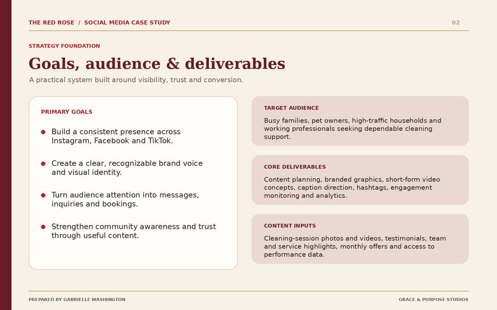
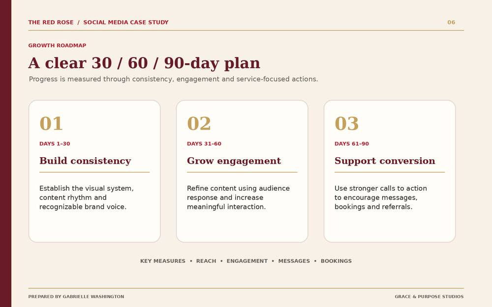
Goals, audience and deliverablesstrategy foundation
Kitchen Sink Clean
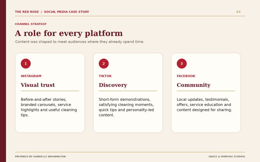
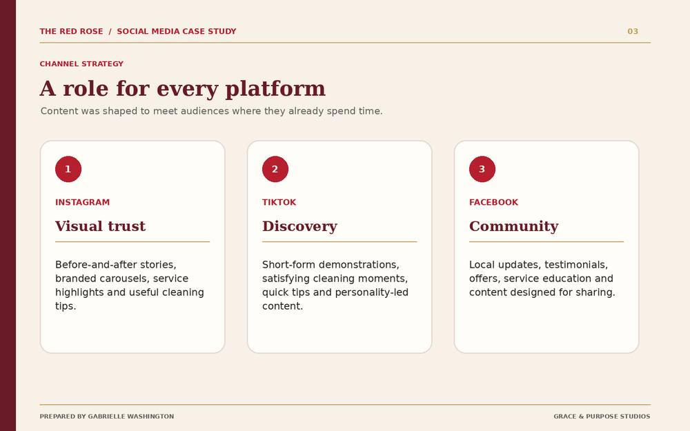
A role for every platforma role for every platform
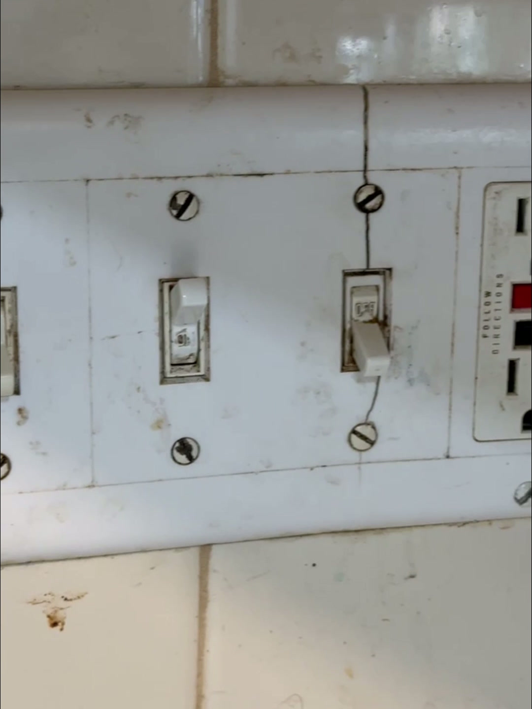
Light Switch Glow Up
Real examples across platformsreal content examples
drag to explore

The strategy behind the scroll.

Platform planning, content systems and reels — all working together behind the finished post.

Grace & Purpose Studios

Before you go,leave a note.

The best projects usually start a little unfinished — an idea, a problem, a feeling, or a “what if?” You don’t need the perfect brief. Just tell me what you’re trying to make happen.

Start where you are.The messy version is welcome here.

Guestbook

Sign the studio guestbook.Leave a little note behind.A hello, an encouragement, or what you enjoyed while exploring the studio.
Your note opens in email so you can send it to the studio.
01 / 07
Brand identity

Built with Grace.
Made for Purpose.

Grace & Purpose Studios began as a brand for my own creative practice. I wanted the identity to feel feminine and expressive without losing the structure a working studio needs.

The goal was never just a pretty logo. It was a visual language I could actually use.
01 · From notebook to mark

The idea started on paper.

Before Illustrator, there were lilies, letterforms, layout tests and a page full of questions. The sketchbook shows the search for something clean, elegant, creative, feminine and connected to growth.
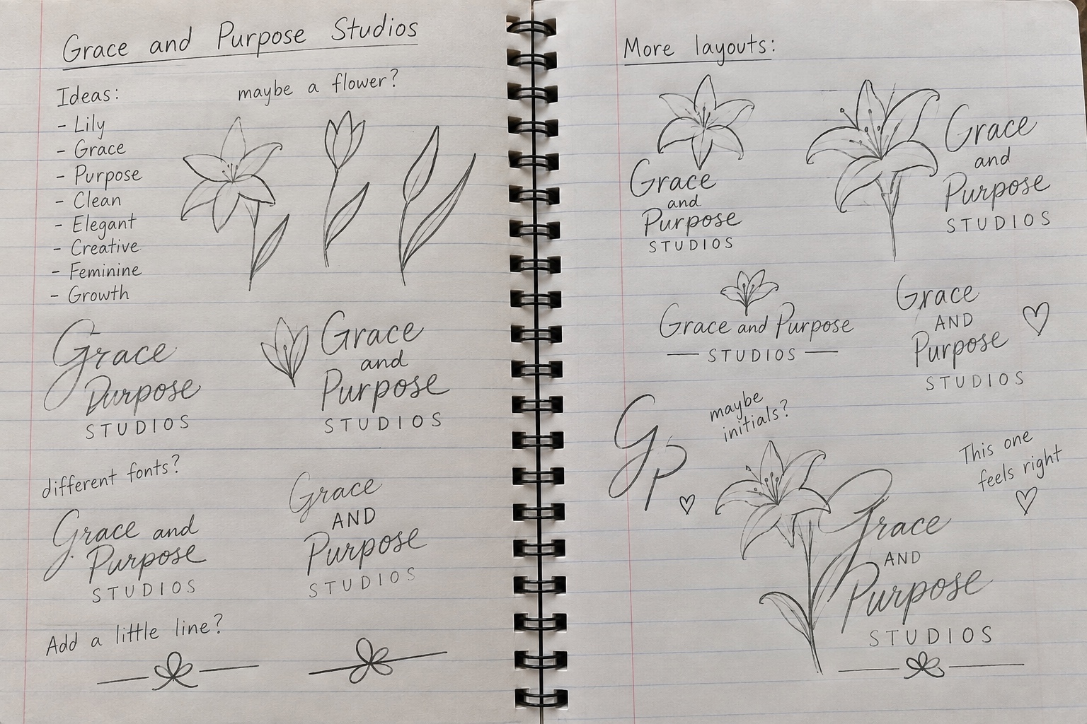
Grace and Purpose Studios original sketchbook spread
Original sketchbook spread · real process
Early Grace and Purpose wordmark and ornament sketches
Early wordmark + ornament thinking
Final sketch direction that felt right
The direction that “felt right”
02 · The identity system

One voice.
More than one form.

The finished system gives the studio a full signature, a compact monogram, a clean wordmark and an alternate treatment — each doing a different job without changing the personality.
GP compact monogram
Compact monogram
Grace and Purpose alternate treatment
Alternate treatment
03 · Brand in use

The identity, living in the world.

Instead of repeating the logo, each application gives a different part of the identity system a job—client-facing, physical and digital.
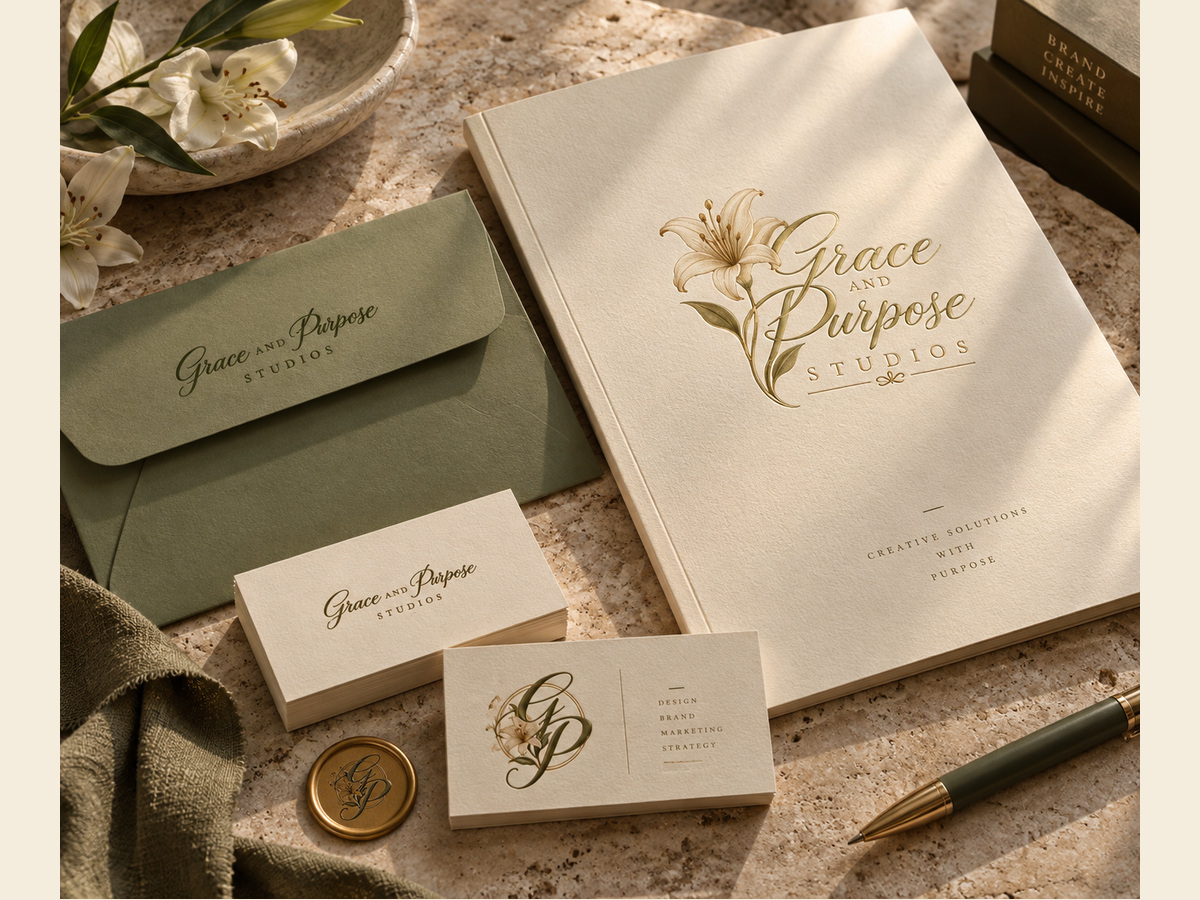
Grace & Purpose Studios stationery mockup
01 · Client stationery

Primary signature on the proposal sheet, wordmark on correspondence, and GP monogram on the smaller card—one system, three scales.
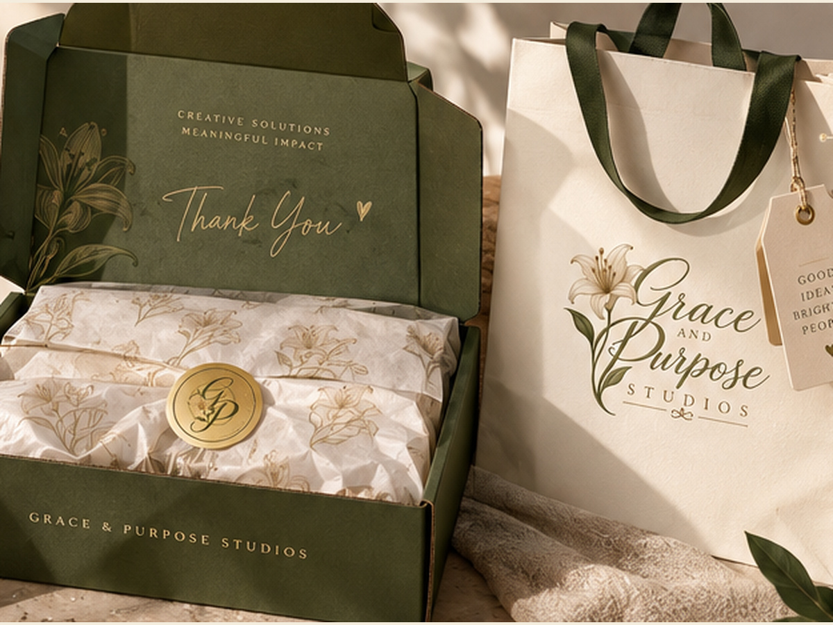
Grace & Purpose Studios packaging mockup
02 · Client experience

The identity extends into the handoff: bag, mailer and seal. The logo becomes something a client can actually hold, open and remember.
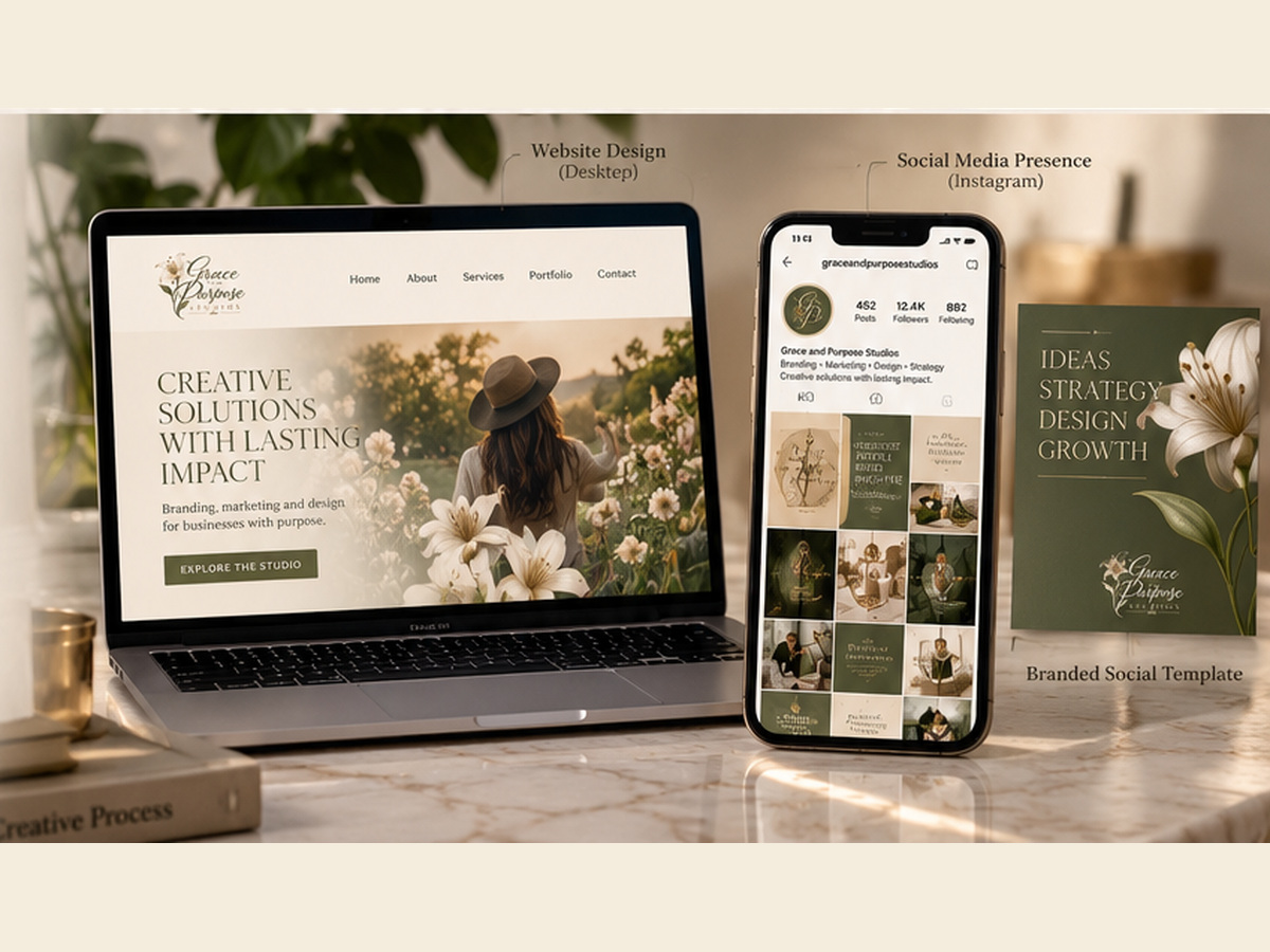
Grace & Purpose Studios digital mockup
03 · Digital presence

The primary mark anchors the website while the compact GP monogram carries into mobile and profile-sized touchpoints.

A brand system designed to move from paper, to packaging, to screen without losing the same Grace & Purpose voice.

04 · What the system proves

A brand can feel personal and still work.

The final identity is expressive enough to feel like the studio, but structured enough to stay consistent wherever it appears.
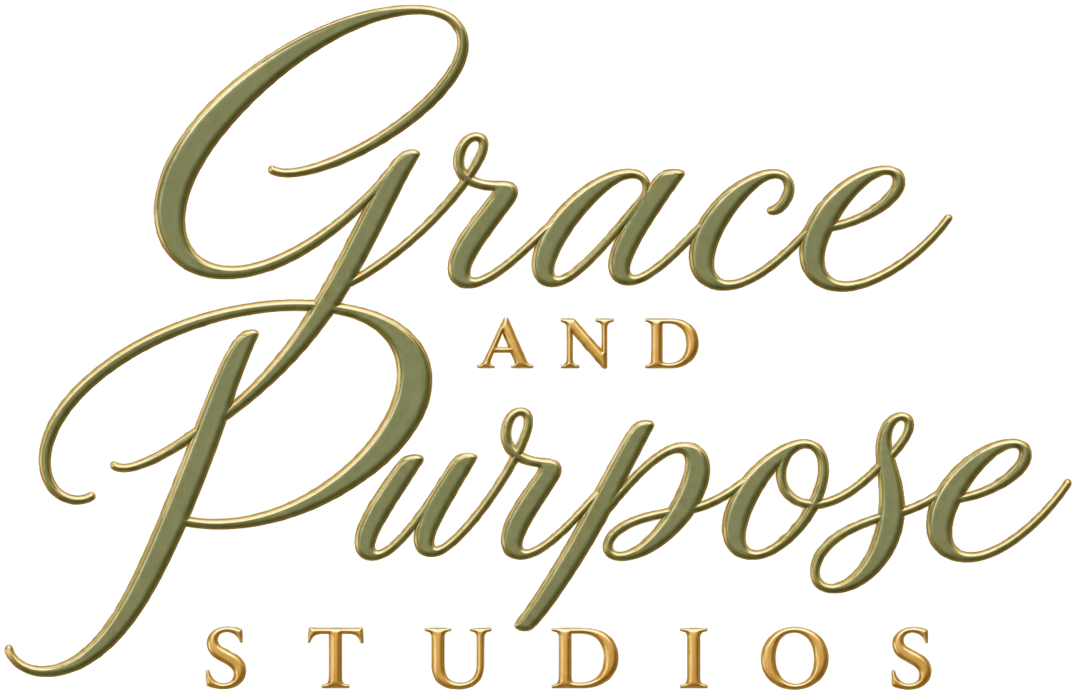
Grace and Purpose Studios wordmark
DistinctiveLilies, script and structured type create a recognizable visual language.
FlexibleFull signature, wordmark and monogram each have a clear job.
UsableThe identity carries naturally from client correspondence to digital touchpoints.

From a sketchbook
to a working studio.

Built with Grace. Made for Purpose.

← Return to Lobby
02 / 06
Experiential Design · Event Planning

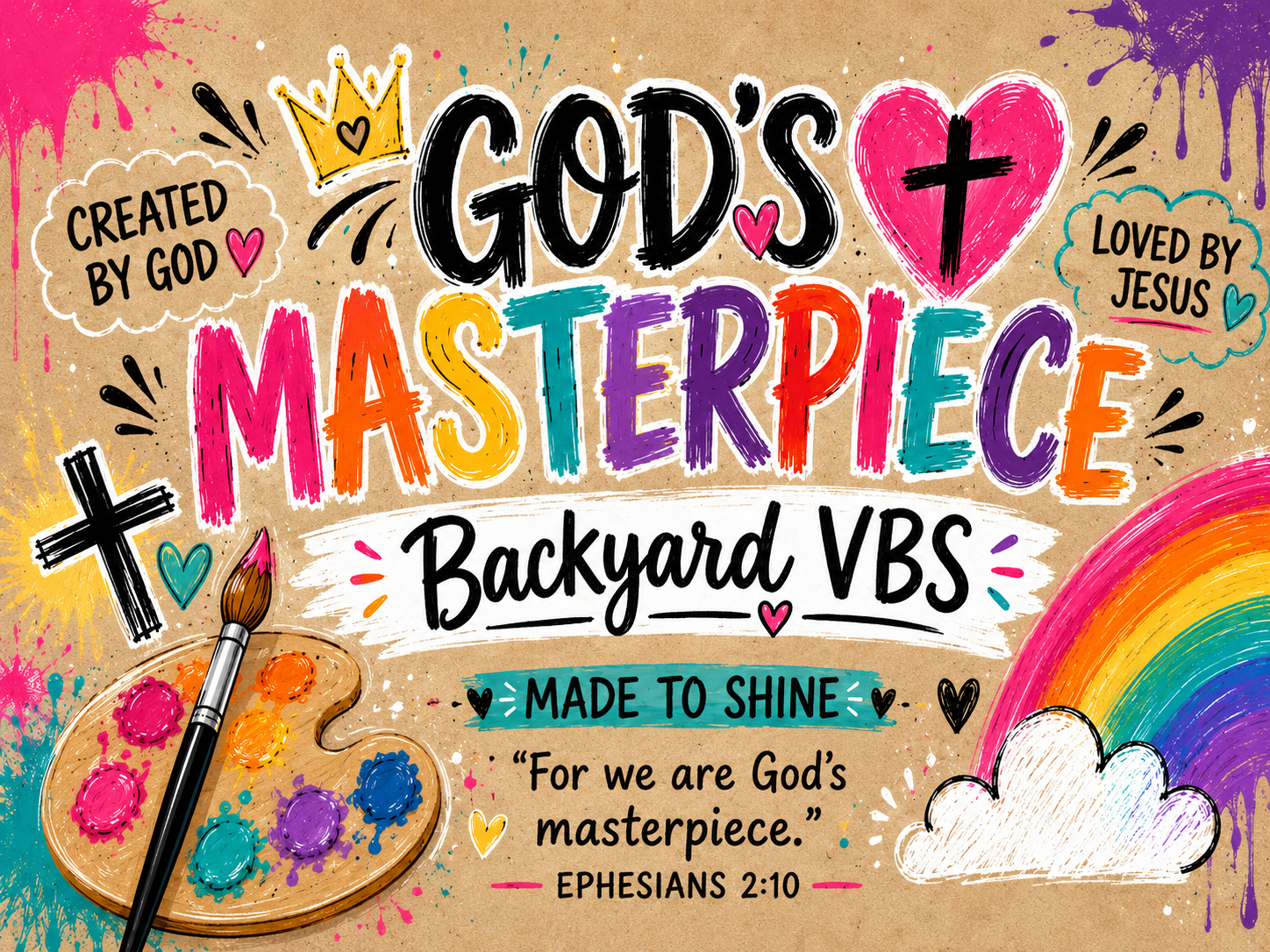
Backyard God's Masterpiece VBS

A three-day backyard VBS I designed, planned and brought to life for four kids.
“Can we have VBS in our backyard?”
Creative DirectionEvent PlanningBrandingActivitiesPrint + Decor
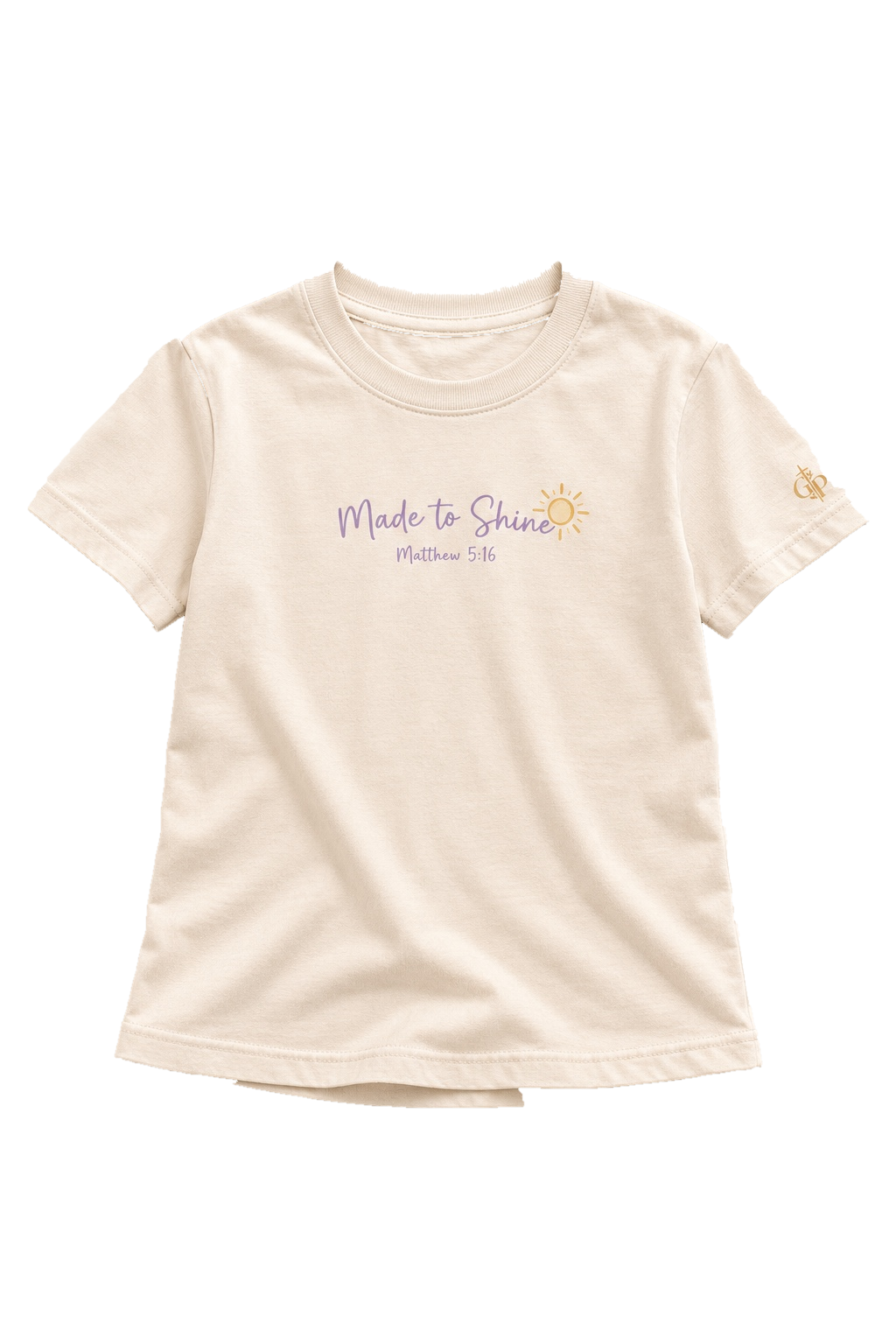
Created by God✦Loved by Jesus✦Made to Shine✦Branding✦Activities✦
01 · What I Built

One small backyard.
A lot of creative direction.

Creative DirectionEvent PlanningVisual IdentityProgram DesignActivity SheetsShirt StudioCraft StudioCaféPrize StationBackdropsDecorAwardsGraduationReels
3Days of VBS
4Kids Served
1Backyard Transformed
100%Designed + Built by Me
02 · THE WORLD I CREATED

Pick a station. Step into the fun.

SWIPE THE STATIONS →

FACE PAINT

Made to Shine

SHIRT STUDIO

Made to Wear

PRIZE STATION

Treasure Box

03 · FROM IDEA → REAL LIFE

Made it. Then they lived it.

01 · INVITE
02 · DESIGN
04 · CELEBRATE
04 · SEE IT IN MOTION

Lights. Camera. VBS!

05 · Three Days, One Story

Three days. One bright little world.

God Made Me

Activity sheets · craft studio · creativity.

God Loves Me

Shirt studio · hands-on connection.

God Has Purpose

Graduation · awards · celebration.

06 · Memory Wall

The world they stepped into.

Backyard world
Exhibit 02 · Closing Thought

One question. Three days. Four kids. A whole world.

I build the visual world, plan the experience and carry the story through the final moment.

Return to Lobby
About Gabrielle

The person behind Grace & Purpose.

Grace & Purpose Studios exists because I wanted to use the creative talent God blessed me with to build something meaningful. My daughter is my grace and my purpose — the reminder that the work should be beautiful, useful, and rooted in something bigger than me.

I’m a graphic designer and digital marketing strategist who loves the point where ideas, people, story, and strategy finally click.
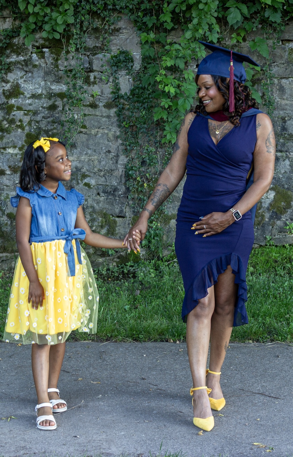
hi, I’m Gabbie ✦
Gabrielle with her daughter
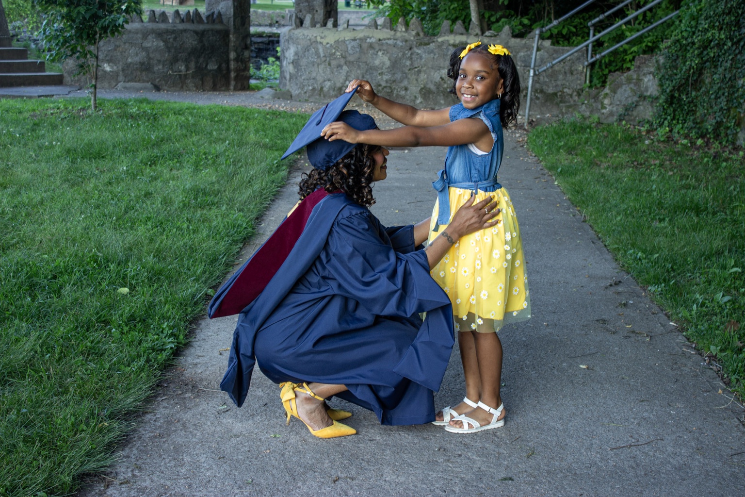
my why, in real life.
Gabrielle and her daughter during graduation
My Grace. My Purpose.
The part behind the portfolio

I want the work to feel good — and make sense.

Pretty matters to me, but pretty by itself is never enough. I want to understand who something is for, why it belongs there, and what it needs to do.

That’s where my design background and marketing brain meet: I notice the details, question the reason, and keep refining until the whole thing feels intentional.

My daughter is my grace. God gave me the gift; she gave it purpose.
Education · West Virginia University

Two degrees.
One creative brain.

Design taught me how to make ideas visible. Marketing taught me how to make them connect.

Design → Strategy → Purpose
01
Bachelor’s · West Virginia University

Graphic Design

Typography · Visual Systems · Composition · Concept Development
02
Master’s · West Virginia University

Digital Marketing Communications

Audience · Messaging · Content · Research · Strategy
Download Résumé ↘
Gabbie, in motion

The designer is only part of me.

I’m the thinker asking why, the creator building the world around the idea, the mom carrying purpose into the room, and the designer making sure every detail belongs.

Ideas in motion
I notice the 2px before I notice the finish.I ask why before I add more.Give me a spark and I’ll build the world around it.My daughter is never outside the story — she’s part of the purpose.
ideas don’t sit still around here. ✦
The reason Grace & Purpose exists

I built a studio around the way I already see the world.

Grace is the heart I bring to the work. Purpose is the reason I refuse to make something just because it looks nice. Together, they’re the standard I keep coming back to.

— Gabrielle
← Home
The Conversation Room · Contact

Tell me what you’re building.

You do not need a polished brief or all the answers. Bring me the idea, the problem, the goal, or the messy version. We can shape the rest together.
Start where you are.
Brand identityMarketingEditorial + digitalCreative collaborations
A note to the studioFill in what you know. Leave the rest for us to figure out.
Room 06 · Beyond the BriefReturn to gallery
01 · Voice / identity / play

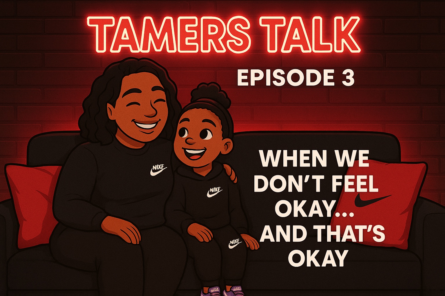
Tamers Talk

This is where I let brand personality get loud—voice, culture, merch and content working together.
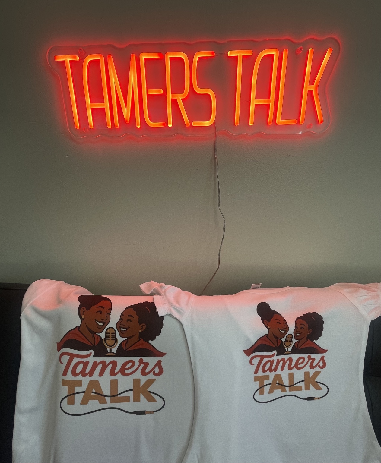
Voice over rules.
● RECNeon + merch
Episode artwork
04 · Space / color / joy

Events

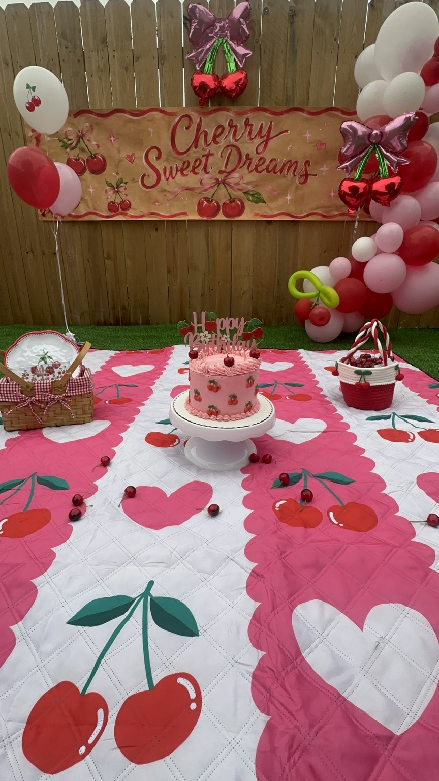
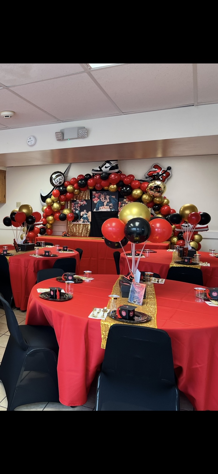
I design the feeling around the moment—the details people notice before they ever think about design.
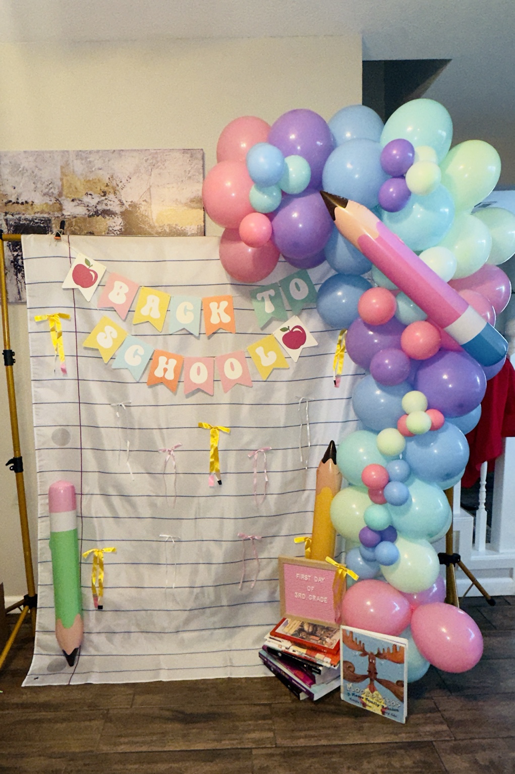
Design should make people feel something.
Back to School
Cherry Sweet Dreams
Graduation
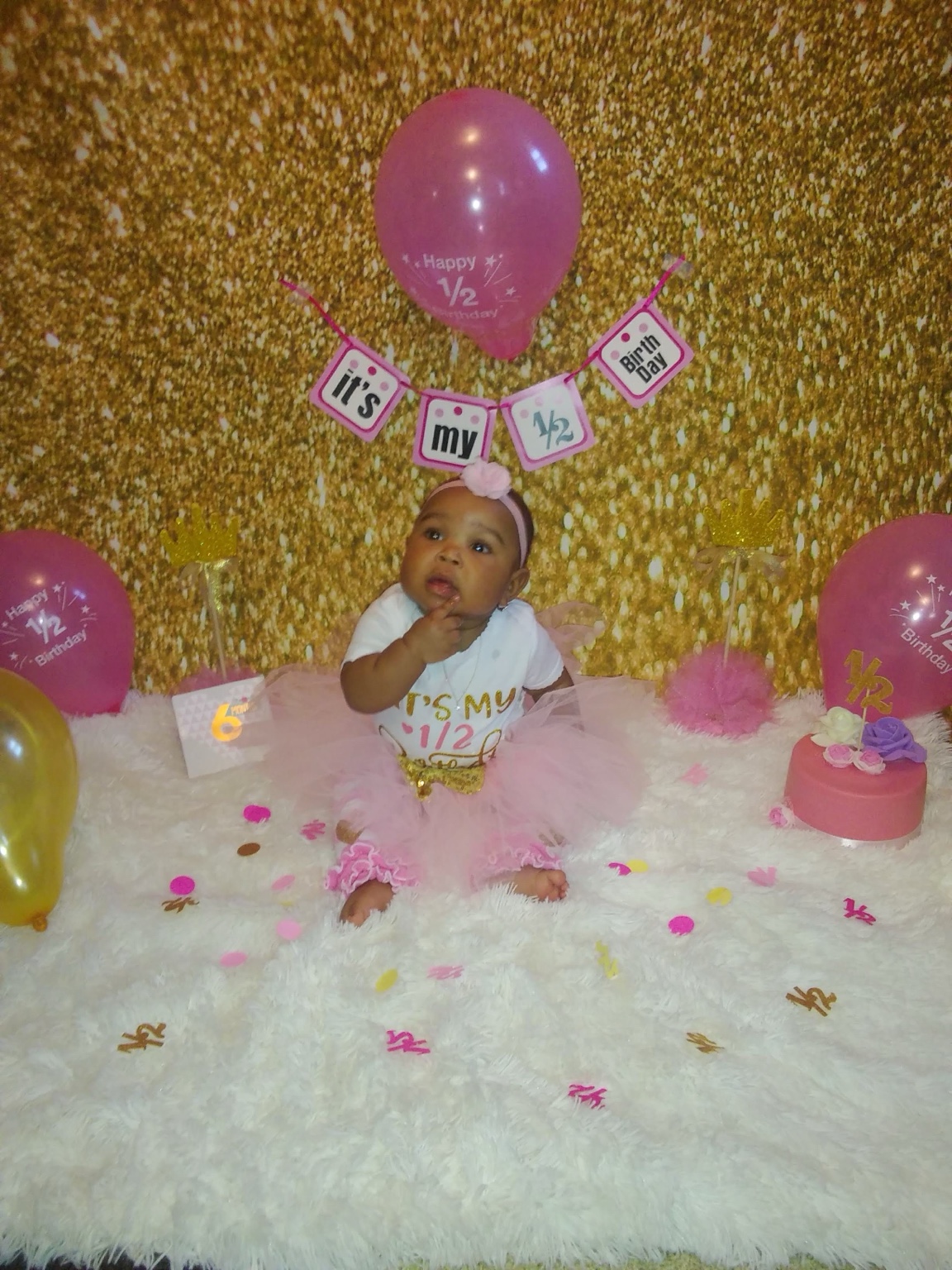
Half Birthday

Collection

Events + Celebrations

Surprise —
this one's for you.

Real spaces, color, movement and personality.
Bring the idea.
I’ll bring the party.

Balloon installs
Backdrops
Custom themes
Dessert tables
Milestones
Props + details
COLOR ✦ MOVEMENT ✦ PERSONALITY ✦ JOY ✦ COLOR ✦ MOVEMENT ✦ PERSONALITY ✦ JOY ✦ COLOR ✦ MOVEMENT ✦ PERSONALITY ✦ JOY ✦
Choose your celebration

Pick the moment.

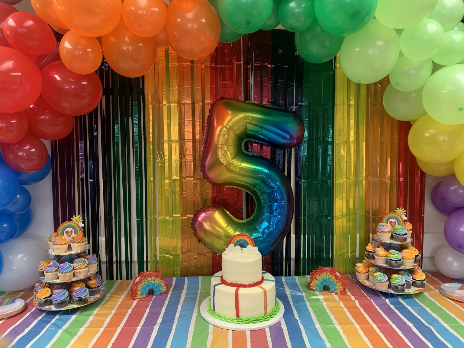
Rainbow Five event setup
01 · Celebration story

Rainbow Five

A bright fifth-birthday celebration filled with joyful color, movement and playful details.

See it move

The party in motion.

Cherry Sweet Dreams
Ghostie Goodies
Boo Day Party
Back to School
Your turn

Let’s make your moment
feel like you.

Bring the theme, the favorite color, the tiny detail or the big idea. I’ll turn it into a celebration that feels personal, joyful and worth remembering.

Plan Your Celebration →
Exhibit 07 · Mineral County Family Resource Network← Return to Lobby
Community · family · practical support

Helping families feel more possible.

Mineral County Family Resource Network supports families with practical tools for routines, home care, meals, organization, connection and community resources.

Design that supports the mission—not just the message.Real program materials, process and an interactive home-learning experience show how the work can live with the families it serves.
Programs in the real world

Identity people can actually live with.

These programs are shown through community touchpoints instead of isolated artwork.
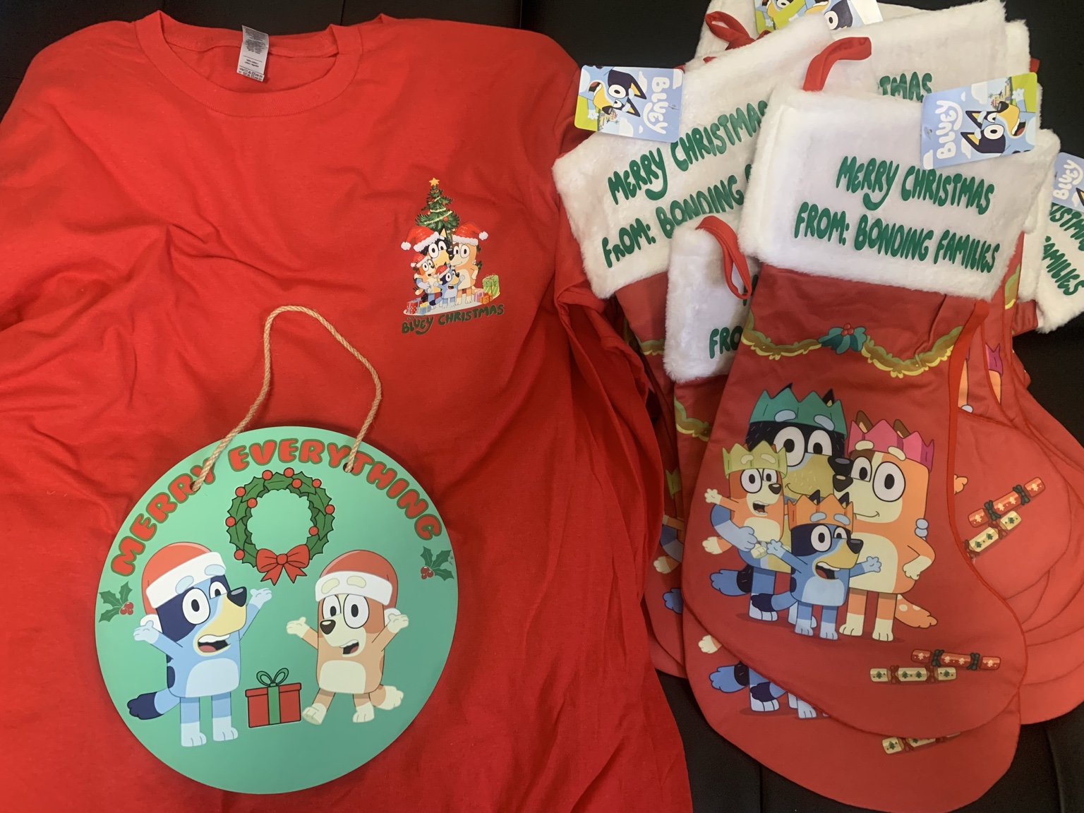
Bonding Families holiday materials

Bonding Families

Family-centered identity carried into gifts, apparel and holiday materials that feel personal and welcoming.
Eternally Home CASA logo
Resource Folder
Office Signage
Welcome Card
Explore the home

Explore the home. Build the habit.

Tap a room to learn one simple family habit, then refresh the space.
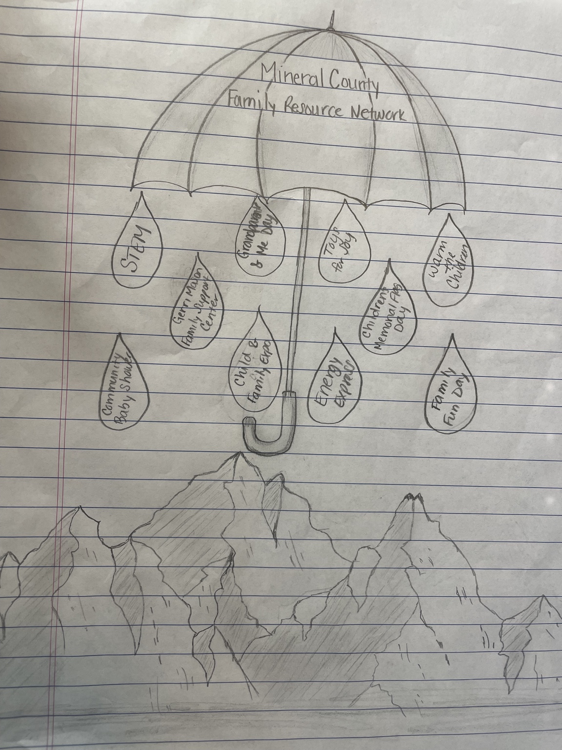
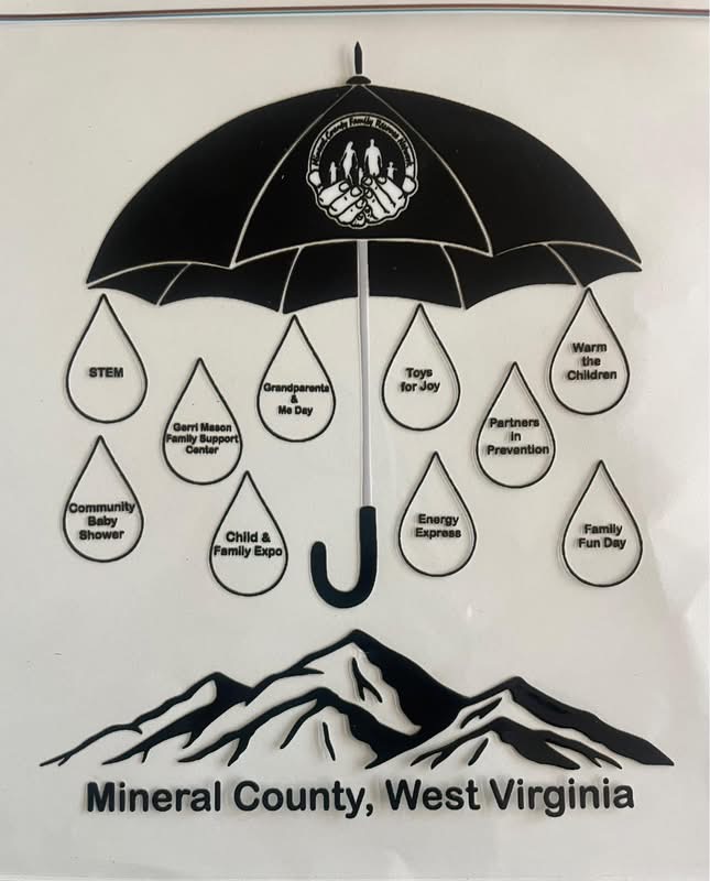
Original hand-drawn Mineral County Family Resource Network umbrella sketch
Original Sketch
Finished Mineral County Family Resource Network umbrella artwork
Finished Artwork
Sketches + process

From one umbrella to a whole support system.

The umbrella began as a simple way to show different programs and resources working together. The sketch and finished identity reveal the thinking behind one connected family-support vision.

Impact in motion

The work matters because the people do.

The impact film brings the mission beyond the graphics—showing the community and families behind the work.

Stronger homes. Stronger families. Stronger community.

Support becomes meaningful when people can use it in everyday life.

Return to Lobby
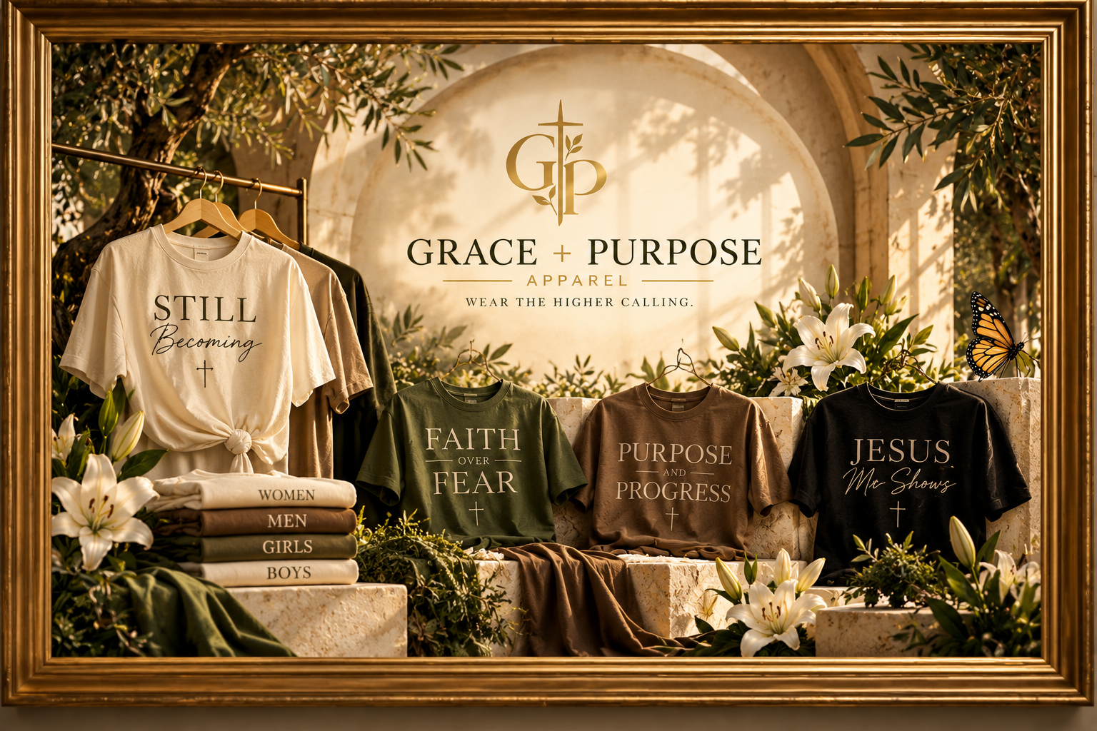
GRACE + PURPOSE APPAREL PRESENTS
THE PURPOSE SHOW

Faith you carry.
Purpose you wear.

Four collections. Four spotlight moments. One higher calling.

ENTER THE SHOW ↓
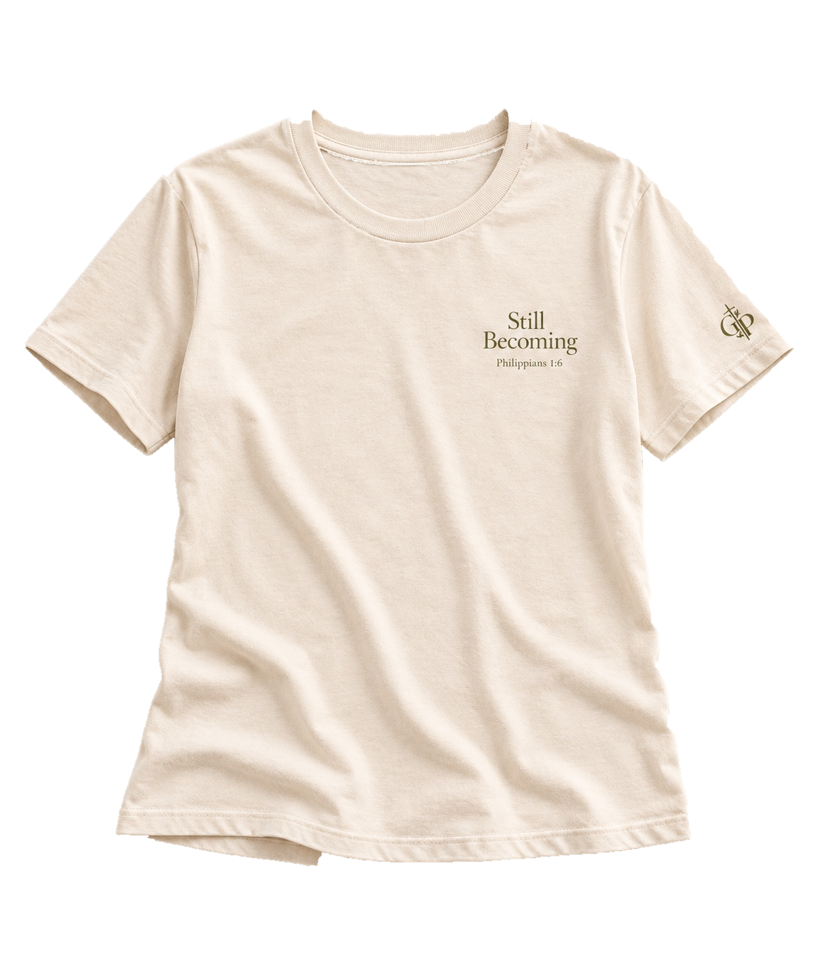
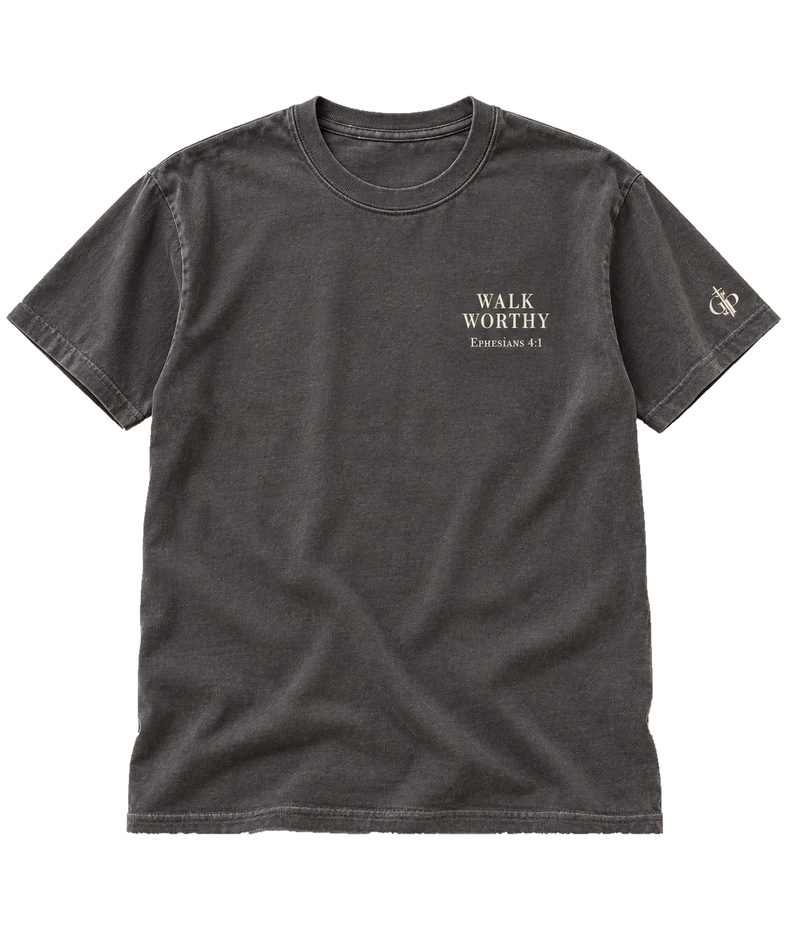
IT STARTED WITHGRACE
AND BECAMEPURPOSE
“God gave me His grace.
Now it’s time to walk in His purpose.”
THE SHOW ENDS · THE CALLING CONTINUES

WEAR THE
HIGHER CALLING.